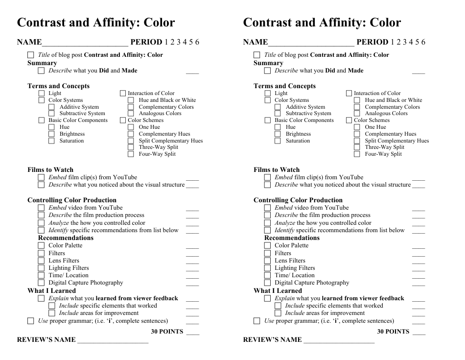
Contrast and Affinity Color Feedback Form
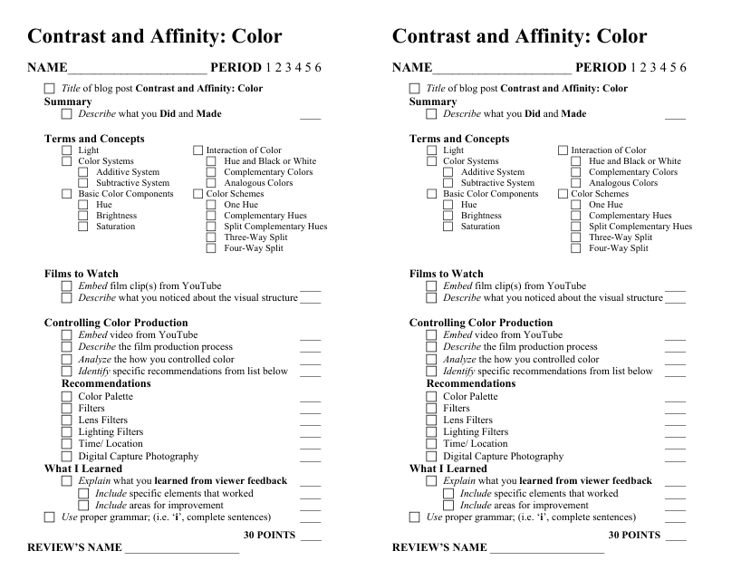
The Contrast and Affinity Color Feedback Form is designed to gather feedback on the visibility and usability of color combinations used in visual materials such as documents, websites, or graphic designs. It helps ensure that color choices are accessible to individuals with varying degrees of color vision deficiency or visual impairments.
The Contrast and Affinity Color Feedback Form can be filed by anyone who wants to provide feedback on the contrast and affinity of colors in a particular document or design.
FAQ
Q: What is the purpose of the Contrast and Affinity Color Feedback Form?
A: The purpose of the Contrast and Affinity Color Feedback Form is to gather feedback and suggestions related to the use of colors in design.
Q: Why is it important to consider contrast and affinity in color design?
A: Considering contrast and affinity in color design is important because it helps ensure readability, accessibility, and visual harmony in designs.
Q: What is contrast in color design?
A: Contrast in color design refers to the difference in brightness and hue between two colors.
Q: What is affinity in color design?
A: Affinity in color design refers to the visual harmony and compatibility between different colors.
Q: How can I provide feedback using the Contrast and Affinity Color Feedback Form?
A: You can provide feedback using the Contrast and Affinity Color Feedback Form by filling out the required fields and submitting your comments and suggestions.
Q: Who can use the Contrast and Affinity Color Feedback Form?
A: The Contrast and Affinity Color Feedback Form can be used by anyone who wants to provide feedback or suggestions related to color design in various visual materials.