 PDF
PDF
 Word
Word
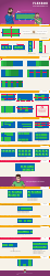
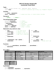
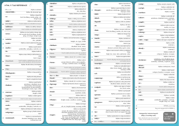
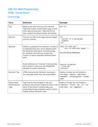
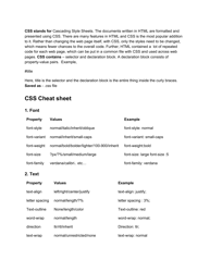
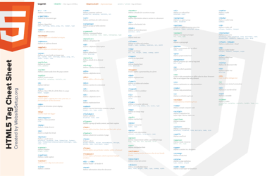
Css Flexbox Cheat Sheet (Japanese)

The CSS Flexbox Cheat Sheet (Japanese) is a reference guide that provides information and examples on how to use the CSS flexbox layout module. It is designed to help web developers and designers quickly understand and implement flexbox properties and values in their projects. It assists in creating flexible and responsive layouts by giving users a handy resource to consult for flexbox syntax and use cases.
FAQ
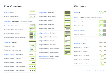
Q: What is a flexbox?
A: Flexbox is a CSS layout module that provides a flexible way to arrange and align elements within a container.
Q: What are the main benefits of using flexbox?
A: Flexbox allows you to create responsive and flexible layouts, making it easier to create dynamic and adaptive web designs.
Q: How do I use flexbox in CSS?
A: To use flexbox, you need to define a flex container by setting the display property of the container element to 'flex' or 'inline-flex'.
Q: What are the main flexbox properties?
A: Some of the main flexbox properties include 'flex-direction', 'flex-wrap', 'justify-content', and 'align-items'.
Q: How can I align items vertically in flexbox?
A: You can align items vertically in flexbox by using the 'align-items' property, which allows you to align items along the cross-axis of the flex container.
Q: Can I change the order of flex items?
A: Yes, you can change the order of flex items by using the 'order' property, which specifies the order in which the flex items appear.
Q: How can I create a responsive flexbox layout?
A: You can create a responsive flexbox layout by using media queries to change the flexbox properties based on the screen size or device.
Q: Are there any browser compatibility issues with flexbox?
A: Flexbox is supported by most modern browsers, but there may be some minor compatibility issues with older versions of Internet Explorer.

