 PDF
PDF
 Word
Word
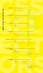
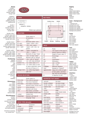
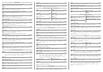
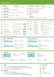
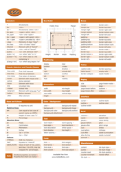
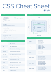
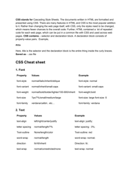
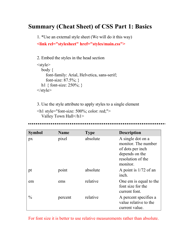
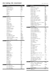
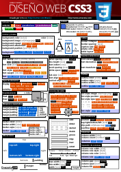
Css Flexbox Cheat Sheet

A CSS Flexbox Cheat Sheet is a reference guide that provides a summary of the different properties and values used in CSS Flexbox. It helps web developers quickly understand and use the flexbox layout model to create flexible and responsive webpage designs.
FAQ
Q: What is CSS Flexbox?
A: CSS Flexbox is a layout module in CSS that helps to create flexible and responsive layouts.
Q: How do I use CSS Flexbox?
A: To use CSS Flexbox, you need to apply display:flex or display:inline-flex to the parent element and use flex properties to control the layout of the child elements.
Q: What are the main properties of CSS Flexbox?
A: Some of the main properties of CSS Flexbox include flex-direction, justify-content, align-items, and flex-wrap.
Q: What is flex-direction?
A: flex-direction is a property that determines the direction of the flex items. It can be set to row, column, row-reverse, or column-reverse.
Q: What is justify-content?
A: justify-content is a property that defines how flex items are aligned along the main axis of the flex container. It can be set to flex-start, flex-end, center, space-between, or space-around.
Q: What is align-items?
A: align-items is a property that determines how flex items are aligned along the cross axis of the flex container. It can be set to flex-start, flex-end, center, baseline, or stretch.
Q: What is flex-wrap?
A: flex-wrap is a property that controls whether flex items should wrap to multiple lines or stay on a single line. It can be set to nowrap, wrap, or wrap-reverse.
