 PDF
PDF
 Word
Word
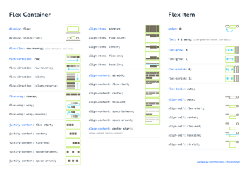
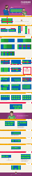
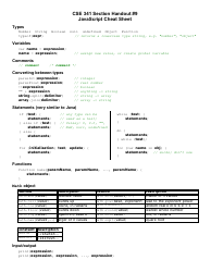
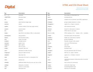
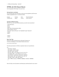
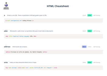
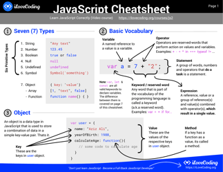
Css Flexbox Cheatsheet

A CSS Flexbox cheatsheet is a quick reference guide that provides a summary of the properties and values used in CSS Flexbox, a layout module in CSS. It helps developers understand and use the different Flexbox properties to create flexible and responsive web layouts.
FAQ
Q: What is CSS Flexbox?
A: CSS Flexbox is a layout model that helps you align and distribute space among items in a container, even when their size is unknown or dynamic.
Q: How do I use CSS Flexbox?
A: To use CSS Flexbox, you need to define a container element with the display property set to 'flex', and then apply various flex properties to the child elements within that container.
Q: What are some commonly used flex properties?
A: Some commonly used flex properties include: 'flex-direction' (to define the direction of the main axis), 'justify-content' (to align items on the main axis), and 'align-items' (to align items on the cross axis).
Q: Can I use CSS Flexbox in all web browsers?
A: CSS Flexbox is supported by all major modern web browsers, including Chrome, Firefox, Safari, and Edge. However, older versions of Internet Explorer may have limited support or require vendor-prefixes.
Q: What are some benefits of using CSS Flexbox?
A: Some benefits of using CSS Flexbox include: easy alignment and distribution of elements, responsive design capabilities, and reduced need for complex CSS hacks or workarounds.
